
Choosing a white paint sounds simple until you put it on the wall and it turns pink, yellow or grey. Sherwin Williams Origami White is one of the most popular off-whites because it looks soft and calm without feeling stark. This guide explains what it really looks like in a real room, where it works best, and how to test it before you paint a whole house.
What Sherwin Williams Origami White Is
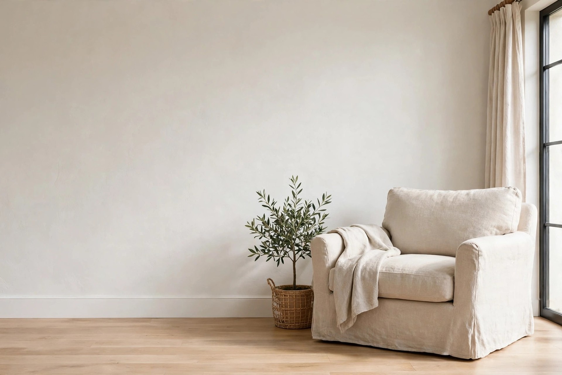
Sherwin Williams Origami White is a soft off-white paint colour, sold under the code SW 7636, that reads as a clean, creamy white rather than a bright, stark white. It has enough pigment in it to show up as a colour on the wall, so it never looks like plain primer, but it stays light enough to work in almost any room.
Origami White belongs to the Sherwin Williams white and off-white family. Its hex code is #E5E2DA, and its RGB values are 229, 226, 218, which tells you it is a very light colour with a touch of warmth in the mix. On a small chip it can look like a plain warm white, but on a full wall the soft grey and creamy tones become easier to see.
Sherwin Williams Origami White LRV Explained
The LRV of Sherwin Williams Origami White is 76, which means it reflects about 76 percent of the light that hits it, so it is a light off-white rather than a true white. LRV stands for Light Reflectance Value, measured on a scale from 0 for pure black to 100 for pure white.
In practice, an LRV of 76 means the colour bounces back plenty of light and lifts a dim room, but it still shows as a colour against pure white trim. Paint reviewers generally class anything with an LRV from about 72 to 82 as off-white, with anything above 82 counting as true white, so Origami White sits squarely in the off-white range.
Undertones: Violet, Warm or Both?
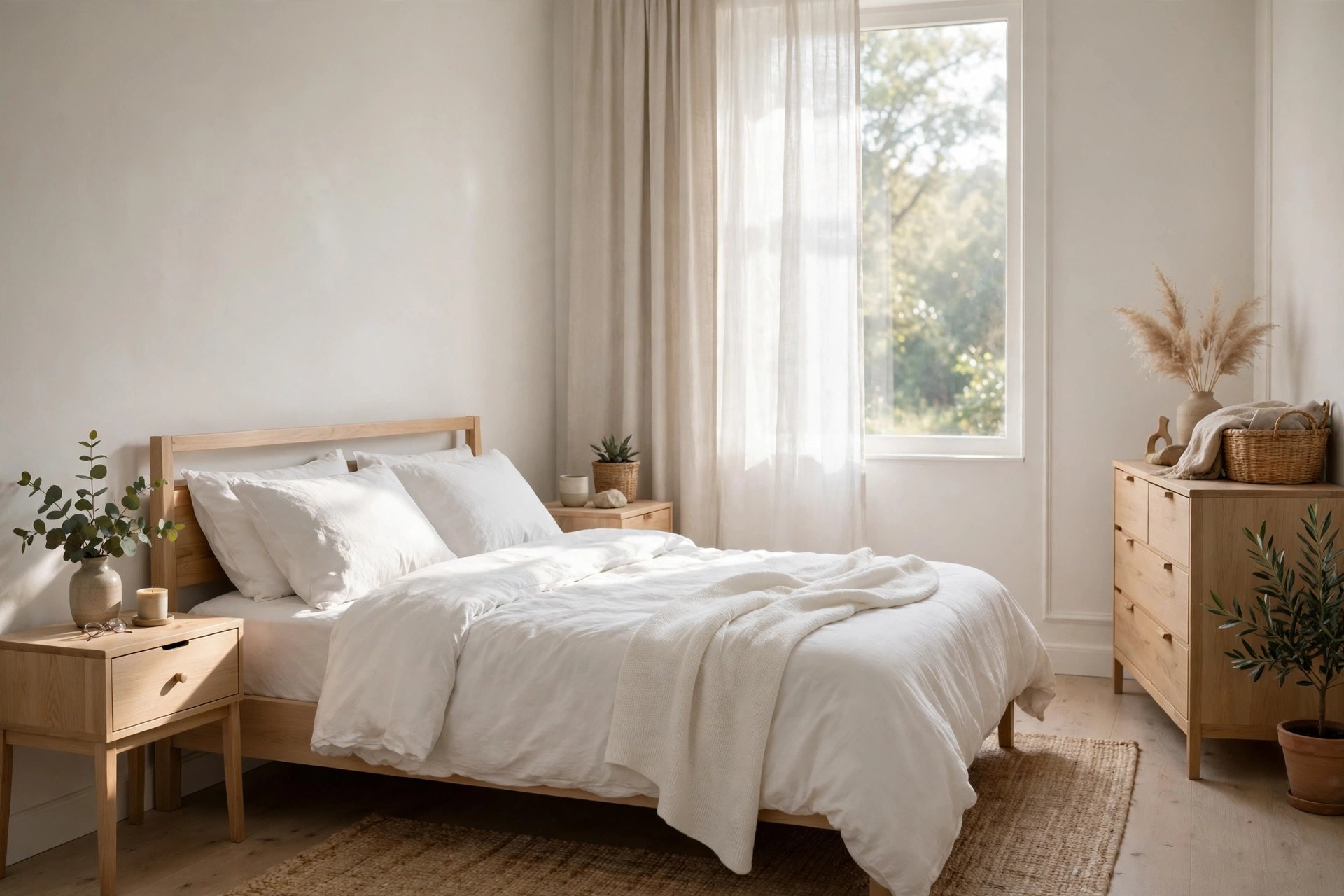
Sherwin Williams classifies Origami White as having cool violet undertones, yet many homeowners and paint reviewers find it reads warm and creamy in real rooms, so the undertone depends heavily on your lighting. This disagreement is the most important thing to know about the colour before you use it.
The violet undertone is subtle and usually shows up only when you compare Origami White directly with other neutrals, or in a cool north-facing room, where it can flash a faint taupe or violet-grey. In warm afternoon sun, especially in south- or west-facing rooms, the same paint can read as pale butter or cream, because the yellow in the light brings out the warm side of the colour.
The practical lesson is simple: do not judge this paint from a chip, and do not trust a single photo. Paint a large sample on your own wall and look at it in the morning, in the afternoon and under your evening lamps. If it stays soft and creamy in all three, it will work in your home. If it turns purple next to your grey sofa or your cool white trim, you will see that in the sample before you commit.
Origami White in Living Rooms
Origami White works well in living rooms because it brightens the space without the cold feeling of a stark white, and it lets furniture, art and wood tones do the talking. It is a popular whole-room colour for open-plan living areas, where one colour has to cover a large stretch of wall without feeling boring.
In a living room, pair it with light or mid-tone wood, linen sofas and warm metals such as brass. The soft white makes dark furniture stand out without clashing, and it makes colourful art look richer. Because the colour is light, it also helps a living room with a low ceiling feel taller, especially when the ceiling is painted in a brighter white.
Origami White in Bedrooms
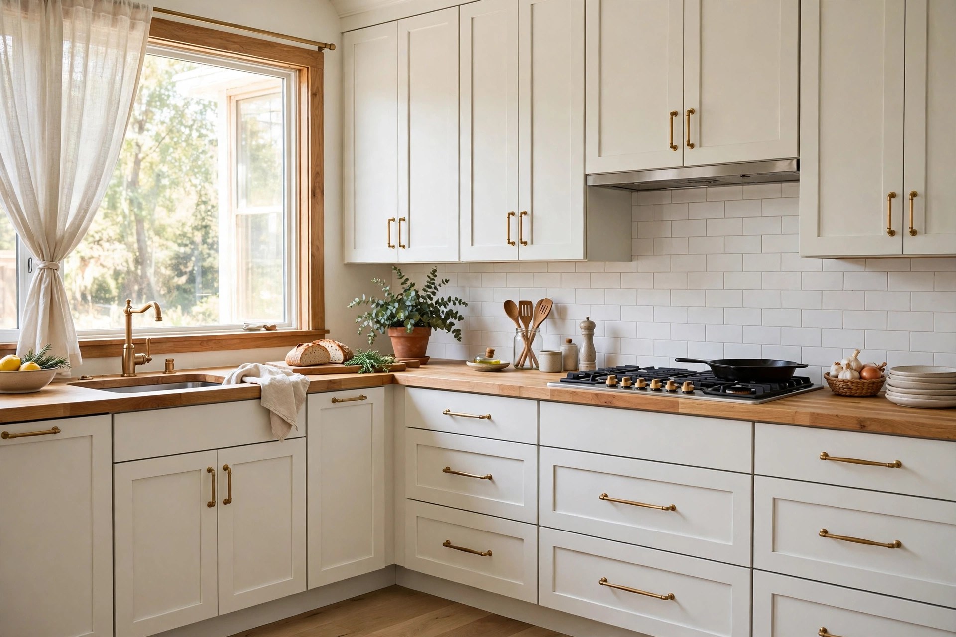
In bedrooms, Sherwin Williams Origami White creates a calm, restful feeling, because the soft off-white is gentle on the eyes in the morning and warm under lamplight at night. It is a good choice if you want a light bedroom that still feels cosy rather than clinical.
Pair it with white or cream bedding, light wood furniture and soft textures such as wool throws and linen curtains. The colour sits well with both cool and warm bedding, which makes it easy to change the look of the room later without repainting. A darker headboard or a navy or sage accent can give the room a focal point without fighting the walls.
Origami White in Kitchens and on Cabinets
Origami White is a popular choice for kitchen walls and cabinets because it looks clean without the harsh glare of a bright white, and it pairs well with wood, stone and stainless steel. On cabinets it reads as a soft white that feels warmer than a pure white cabinet, which suits traditional and modern kitchens alike.
For cabinets, a satin or semi-gloss finish is the practical pick, because it wipes clean after cooking splashes and steam. For walls, eggshell is usually enough. Check the colour next to your worktop and splashback, since a cool grey worktop can pull out the violet side of the paint, while a warm wood worktop brings out the creamy side.
One warning from paint reviewers is worth hearing: because Origami White has an LRV of 76, it can look darker than you expect next to a bright white trim or a white appliance. If your kitchen already has bright white trim, test the cabinet sample beside it first. For guidance on the painting itself, see our guide to how to paint kitchen cabinets for a smooth, lasting finish.
Origami White in Bathrooms and Exteriors
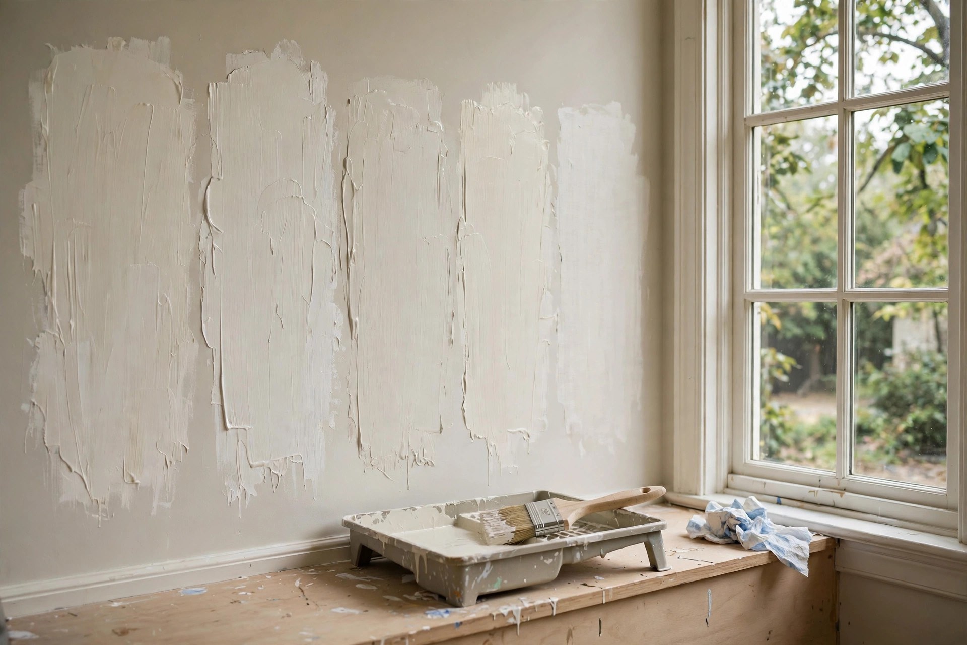
Origami White works in bathrooms as a soft wall colour that flatters skin tones better than a stark white, and it can work on exteriors too, although strong sun can wash it out toward a true white. In both cases the light in the room decides how the colour reads.
In a bathroom, pair it with white tiles, a light wood vanity and warm metals. The creamy tone stops a small bathroom feeling cold, and it hides everyday marks better than a pure white wall. Use a finish made for bathrooms, such as a satin or a moisture-resistant eggshell, so steam and splashes do not mark the paint.
On an exterior, the same LRV of 76 means full sun can make the colour look much lighter, almost like a true white, from the street. That can be a pleasant effect on a house with dark shutters or a dark roof, but if you want the creamy tone to show from outside, test a large sample on the wall in full sun first. Trim in a brighter white will keep the edges crisp.
Best Coordinating Colours and Trim
The best coordinating colours for Origami White are warm greys, soft greiges, sage green, light wood tones and warm whites, because they share its soft, muted character. For trim, Sherwin Williams Pure White gives a clean contrast, while a softer white such as Alabaster gives a gentler, more blended edge.
For a whole-house palette, pair Origami White walls with a slightly darker greige in a hallway or a soft sage in a bedroom. For furniture, natural linen, light oak and walnut all sit well against it. Avoid pairing it with a sharp, cool white over a large area, since the contrast can make Origami White look yellow or dirty by comparison.
Origami White vs Alabaster and Other Whites
Origami White is slightly darker and cooler in classification than Alabaster, which has an LRV of 82 and warmer yellow undertones, so Alabaster reads creamier and brighter on the wall. The difference is small on a chip and much clearer on a full wall in daylight.
The table below compares Origami White with a few whites people often consider alongside it, using the LRV figures published by paint colour reviewers. Always confirm the numbers on the paint chip, since digital swatches vary from screen to screen.
| Paint colour | Code | LRV | How it reads |
|---|---|---|---|
| Sherwin Williams Origami White | SW 7636 | 76 | Soft off-white, cool violet undertone |
| Sherwin Williams Alabaster | SW 7008 | 82 | Warmer, creamier, brighter white |
| Sherwin Williams Shoji White | SW 7042 | 74 | Darker, heavier greige undertone |
| Sherwin Williams Pure White | SW 7005 | 84 | Clean bright white, good for trim |
| Sherwin Williams Snowbound | SW 7004 | 83 | Lighter than Origami White, cooler tone |
If you want the warmest, brightest white of the group, Alabaster is the pick. If you want a soft white with a little more colour and a calmer feel, Origami White is the better choice. Shoji White is the greyer, darker option, and Pure White is the trim colour most people pair with all of them.
How to Test Origami White Before You Paint
Test Sherwin Williams Origami White with a large painted sample on the actual wall, viewed in daylight and in evening light for at least two days, before you buy a full gallon. A white that looks perfect on a chip can turn grey, yellow or violet at full size.
Buy a sample pot or a peel-and-stick sample and put it on the wall you plan to paint. Paint two coats on a board at least the size of a sheet of paper, and move it around the room at different times of day, next to your sofa, your floor and your trim.
- Paint a large sample. Use two coats on a board or directly on the wall, at least A3 size, so the colour reads at real scale.
- Check it in daylight. Look at it in morning light and again in afternoon sun, when the warm side may show.
- Check it under your lamps. Evening light changes whites more than any other colour, so view it after dark too.
- Hold it next to your trim. Compare it with your white trim and ceiling, since the gap between the two decides how it reads.
- Compare it with one rival. Put Alabaster beside it and pick the one that looks right in your dimmest corner.
- Live with it for two days. A white that looks clean on day one can feel grey or creamy by day three, so give it time.
If the sample looks grey in your north-facing room, that is not a fault in the paint, it is a sign of your light. You can either accept the cooler version or pick a warmer white. A sample costs little and saves a repaint.
Common Mistakes to Avoid
The most common mistakes with Origami White are using it as a trim colour next to a brighter white, judging it from a small chip, and pairing it with cool grey floors without testing first. Each of these makes a soft white look like the wrong white.
As a trim colour, its LRV of 76 can look dingy next to a bright white wall or ceiling, so most reviewers suggest keeping it for walls and using a brighter white for trim. Judging it from a chip is risky for the same reason: the violet undertone only shows at full size, and the warm side only shows in your own light.
Another mistake is choosing the wrong sheen. Flat paint on a hallway wall shows marks quickly, while a high-gloss finish on a rough wall shows every bump. For walls, matte or eggshell usually looks best; for cabinets and trim, satin or semi-gloss is the practical choice. For help choosing the right paint for each room, see our guide to what kind of paint to use on interior walls, and our guide on whether ceiling paint is usually flat.
When Origami White Is Not the Right Choice
Origami White is not the right choice if you want a bright, crisp white, a true trim white, or a colour that stays exactly the same in every light. It is a chameleon white, and that is both its charm and its risk.
If you want a clean, bright white for trim or ceilings, Pure White or Snowbound will serve you better. If you want a warm, creamy white with no hint of violet, Alabaster is the safer pick. And if your room has very cool light and you dislike any grey or violet cast, a warmer off-white may suit you more.
That does not mean you have to give up on it. Use it in a room with warm light, or pair it with warm wood and warm metals, and the creamy side will win. Knowing what a colour does in your light is part of choosing it well. Before you repaint, check whether the colour of your ceiling paint should match your walls, since that choice changes how any white reads.
Conclusion
Sherwin Williams Origami White is a soft off-white with an LRV of 76 and a subtle violet undertone that often reads warm and creamy in real homes. Use it on walls, in bedrooms and kitchens, and on cabinets, pair it with warm whites, light wood and soft greys, and always test a large sample in your own light first. Done that way, it gives a home a calm, bright feeling without the cold edge of a stark white. If you want a brighter trim white or a warmer cream, pick its rival instead, and let Origami White be the soft wall colour it does best.
Frequently Asked Questions
What is the LRV of Sherwin Williams Origami White?
The LRV of Sherwin Williams Origami White is 76, which means it reflects about 76 percent of light. That puts it in the off-white range, lighter than most colours but darker than a true white.
Does Origami White look yellow or purple?
It can look creamy yellow in warm afternoon sun and faintly violet-grey in cool north light. In most rooms it reads as a soft, clean off-white.
Is Origami White warm or cool?
Sherwin Williams classifies it as cool because of its violet undertone, but many people find it reads warm in real homes. Your lighting decides which side you see.
Can I use Origami White for trim?
You can, but many reviewers warn it looks too dark next to a brighter white. Pure White or Snowbound usually work better for trim and ceilings.
Is Origami White lighter than Alabaster?
No, Alabaster is lighter, with an LRV of 82 compared with 76 for Origami White. Alabaster also reads warmer and creamier on the wall.
Disclaimer: This article is provided purely for informational purposes. clearisecleaningservices.com only provides information about paint colours and home decorating, and does not offer painting services, guest posting, paid promotion, or advertising. Paint colours look different on every wall and screen, so always test a sample in your own home before buying. If you are unsure about surface preparation or paint safety, ask a qualified painter or follow the paint manufacturer’s instructions.
Thanks for visiting Clearise Cleaning Services! Discover more helpful tips and expert cleaning insights by exploring our related categories.